
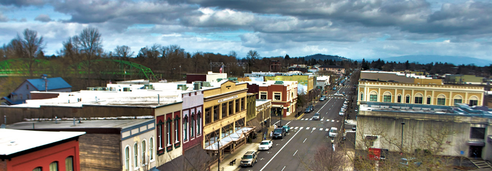
In June we announced the launch of a process to find a flag for Albany, Oregon initiated by our fellow Oregonians at GUAVA (Greater Unified Albany Vexillological Association). Five finalists have been chosen and the public has been rating each on a scale of 0 (low) to 10 (high) at cityofalbany.net/flag. This phase ends this Monday (8 August), so if you want to weigh in on the five contenders and haven’t yet, please do so soon!
Here renditions by graphic designer Steve Kodis (of People’s Flag of Milwaukee fame) of what the flag designs would look like in flight, along with the “artist’s statement” for each.

The two green triangles represent Agriculture and Timber, their combined shape is a tree which represents Albany’s status as a tree city. The two blue stripes represent the Calapooia and Willamette rivers. The gray background represents rare metals and roads.

The triangle wedge on the hoist symbolizes the three names Albany has been called: Takena, New Albany and Albany, with the color green representing the nature and agriculture of Albany.
The 12 pointed star within a circle represents both how the 12 neighborhoods of Albany come together as one community, but it creates 12 white arrows that look inwards towards Albany for guidance as county seat and the Hub City.
The purple stripe is a symbol of Albany’s uniqueness as no current country or American state flag uses purple.
The blue stripe is a symbol of the Willamette River, upon which Albany was founded, and provided the bulk of Albany’s economy during the early years.
The grey stripe is the symbol of Albany being the rare metals capital of the world, upon which much of the current economy is based. The gray stripe also enforces Albany’s uniqueness, as it is a color used rarely in country and American state flags.

Title, ‘Confluence and Crossroads.’ The blue portions represent the confluence of the Calapooia and Willamette rivers. The gray portion represents Interstate 5 and Hwy 20 intersecting, a nod to our Hub City nickname; the gray is also representative of our metal industry. The green portion represents our agriculture, timber, and Tree City designation. The overall design forms an A representing Albany as well.

This flag has a Northwest color scheme of green, blue and black.
Green symbolized Albany’s place as the grass seed capital and its emerging filbert tree market.
Blue symbolizes the importance of the Willamette River and Calapoolia River in their role in establishing Albany and Kalapuya Tribe.
Black represents metal because Albany is the “rare metals capital of the world.”
The white bridge give this flag a landmark and ties in with other symbols currently in use throughout Albany.
The angle at the front of the flag symbolizes Albany’s location within the valley and looks like the slope of a roof of one of Albany’s many historic homes.

Drawing inspiration from the flag of the Confederated Tribes of the Grand Ronde Community of Oregon, in which the Kalapuya tribe was associated, this design silhouettes our city’s background. Using the colors yellow, reflecting wheat or grain, and blue, resembling our Willamette River, the logo is placed on a green background that represents the forests our state is known for.

Mmmmm…. I am not so keen to support any of these (blue and green are probably the two worst colors to put one next to another…) and the stylized letters concept is somewhat unacceptable to me… but I’ll give my vote to the first one, since we have to vote… Maybe a single green triangle separated with a white band would have been ok for the tree and “A” concept actually.
Hi. I saw an article clip about flag for Albany honoring kirt kobain but can’t find it. Do you know about this? Thanks