
by Max Liberman, Vexilloid Tabloid #58
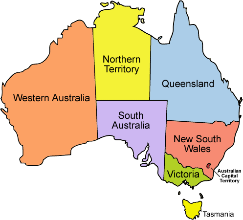
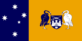
In 2001, Australian vexillographer Brendan Jones produced a series of intriguing proposals for new Australian state flags. The designs follow the pattern established by the flags of the Australian Capital Territory and the Northern Territory: the southern cross from the national flag in a panel at the hoist, and an emblem representative of the state in the fly.
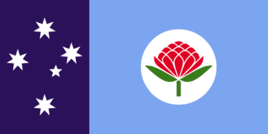
For New South Wales, the hoist is dark blue and the fly sky blue (the state color), bearing a red waratah (the state flower). Jones notes that the waratah “is also of significance to many local Aboriginal peoples and hence serves as an important symbol of Aboriginal recognition and reconciliation”.
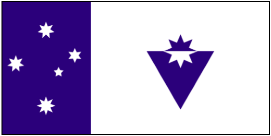
The proposal for Victoria is in dark blue and white. In the fly, an eight-pointed star, taken from the historic Eureka flag of 1854, is counterchanged and combined with an inverted triangle to form the shape of the state’s initial “V”.
For Queensland, the hoist again is dark blue; the gold fly (which represents the state’s sunshine and golden beaches) is charged with a stylized Cooktown orchid (the state’s floral emblem) in maroon, the state color. The orchid’s six petals represent Queensland as the sixth and last of Australia’s states to have been established as a British colony.

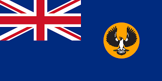
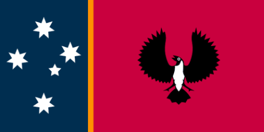
South Australia’s heraldic colors of blue, gold, and red all appear in its proposed flag. The blue hoist represents the Southern Ocean and the red fly the desert of the Outback; a narrow gold fimbriation separates the two and the fly is charged with the piping shrike from the existing state flag and coat of arms.
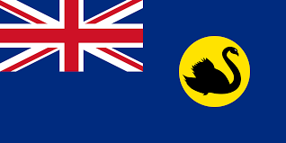
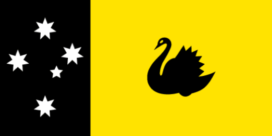
The design for Western Australia uses the state’s heraldic and sporting colors of black (hoist) and gold (fly); the gold also represents the state’s mineral wealth and expansive desert. The fly bears the state emblem, the black swan, which appears in the current flag and badge and evokes the state’s former name, the Swan River Colony.
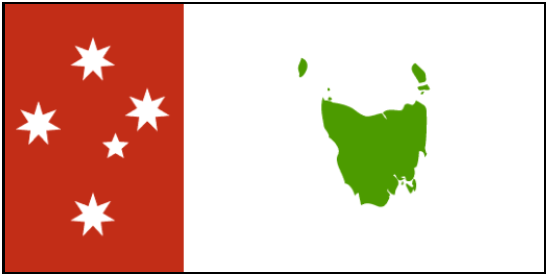
For Tasmania, both the state’s unofficial sporting color (green) and its heraldic colors (red and white) are used. The hoist is red and the fly white, charged with a map of the state in green; the green also symbolizes Tasmania’s natural heritage.
On the whole, the proposed designs are clear and distinctive, and the unifying pattern of the hoist panel with the southern cross makes them unmistakably Australian. All of them would be a considerable improvement over the British colonial ensigns currently serving as state flags. But it might also be felt that the use of the NT/ACT model inappropriately blurs the constitutional distinction between Australia’s states and territories, and that for the states’ flags to adhere to a uniform template does not serve to represent their individual identities and their status as sovereign entities within the Australian federation.
Jones’s website featuring the designs can be found at http://bc.id.au/flags/.

These are my new state designs I made years ago
https://australianflagdesigns.wordpress.com/2015/04/29/new-australian-state-flag-designs/
As an Australian, I agree with the observation that standardising the state flags is unnecessary. Most countries don’t, they understand that the function of a regional flag is to symbolise a region, not the nation, and that each flag should be distinct from its neighbour’s flag. For example, the flag of California doesn’t resemble the US flag or the flag of New Mexico.
I also think some of the emblems here are not drawn very well, a bit amateurish. :/