
In the most recent Vexilloid Tabloid, we announced a design challenge:
Ignoring the political near-impossibility of change…simply from a DESIGN perspective, how could the US flag be improved?
Readers were (and still are!) encouraged to send proposals to editor@portlandflag.org, to be discussed at our next meeting.
Here are two proposals readers have sent in so far.
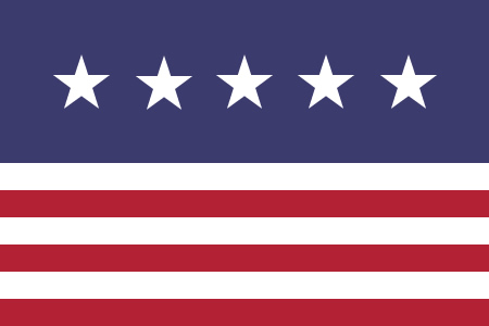
A Mature Union
I am so happy that you bring forward the question of the American flag. I have been complaining for so long about it; I believe it fails both in its symbolism and its representation. I complained to my mother as you kindly suggest in your newsletters, but she doesn’t care about it at all as she is Canadian.
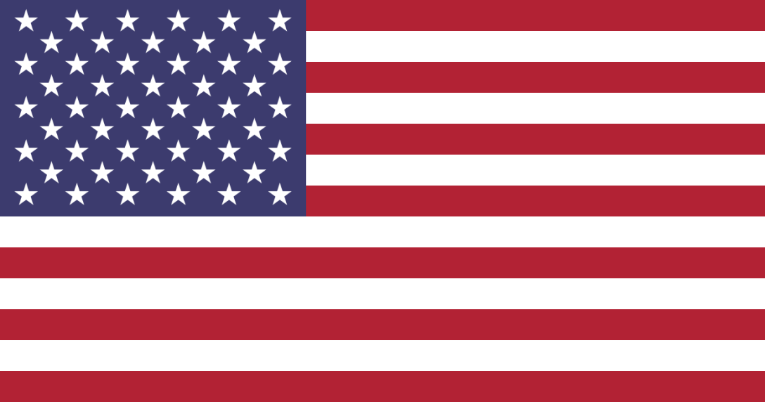
First of all, the idea of representing the 13 states of New England is a poor idea. That’s way too many stripes to begin with, and it is somewhat redundant as those 13 states are also represented by a star. In order for a state to be represented twice, there has to be a really good reason, better than just being the first 13 states of the Union. I mean a REALLY GOOD reason. We will come to that in a few seconds.
Also, those 50 stars are just crazy. There are way too many of them, they are thus too small. As I also suffer from a very rare form of Vexillological Obsessive-Compulsive Disorder (VOCD) which forbids 2 colors like red and blue to touch, I find that flag painful to look at because some of the red stripes touch the blue canton. It just hurts.
Fortunately, I have a solution. First of all, let’s ask ourselves WHY are the United States of America the way they are today. The answer is short and sweet: because the North kicked the a** of the South and the Confederated States were defeated at last. That is quite something, because America is supposed so stand for equality and freedom. I propose to retain only the 6 first states that never seceded and never permitted slavery: Pennsylvania, New York, New Hampshire, Massachusetts, Rhode Island and New Jersey. Those are the 6 “pure” initial States of America. The fact that the 6 bands are located at the bottom of the flag means that the country is now standing on a purer basis, a basis set up by those 6 States in particular.
As for the 50 stars, one can be a bit smarter than using one star for one State. Now that the Union has reach maturity and no new States are expected to join, a single star, made of 10 summits, can stand for 10 stars. We now only need 5 stars, they can be bigger.
This flag is much better than the current one, and I hope it will replace it in the near future.
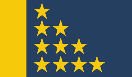
Heresy in Blue and Gold
As this is a purely academic exercise in flag design I guess anything (within the vexillographic rules) goes.
I promised a surprise, so here goes.
In today’s inter-connected world, isolated, solipsistic, sovereignty is a luxury – and even an illusion – that means less than it did at a time of contesting empires (whose chief export was the misery of much of the last century, the effects still with us).
President Obama has warned the British about the risks of “Brexit” (leaving the EU), arousing indignation, that he has a nerve urging Brits to “yield sovereignty – something the United States would never dream of even contemplating”.
Well, let’s think outside the square.
…. At some future date, the US pragmatically seeks and is pragmatically accepted as a member of the EU (after all, if Australia can sing at Eurovision, anything is possible) – or shall we say that the US “returns to its founding matrix”. This makes it stronger (and “greater” than ever, Donald) and puts some backbone into the Transatlantic Alliance as a champion, with Europe, of values and ideas of the Great Books, religious and not, and melting pot that it is, of both East and West but which the West more than others has given the world.
In this imaginary context, a new look USA flag might be expressed in the EU colours.
The 50 states are represented by 10 stars each of 5 points while the Golden Pillar (the Pillar of Fire? Kubrick’s Sentinel?) at the hoist represents both the “united” in the United States and the glow of the Golden West. That refers, not to California and its gilded youth and other fables, but to the vigour of civic values that have evolved over 3,000 years, offered and shared with all of good will.
Heretical as the notion seems, it urges and celebrates ’s solidarity with both “old” and “new” Europe across “The Ditch” (with or without the Brits) but true to the ideals of the Founding Fathers and the Constitution.
Graphically,
1. A not so tongue-in-cheek design avoids the “Crowded House” impression of the current canton in the US flag.
2. It dispenses with the stripes (it’s a long time since there were only 13 states).
3. The triangular arrangement of the 10 stars and their 50 points suggests advance towards the Light,
4. while it also evokes a flag properly folded, an oblique reference to respect for those who have given their lives for “good and brotherhood, from sea to shining sea[s]”. (Apologies to Katharine Lee Bates).

I like the one by Mathieu P. Too bad it won’t “fly.”
The blue and gold one is very dynamic. In fact, I want to put my hands on those mullets and arrange them into a more static and symmetrical layout.
I think the red & white stripes and the white stars on a blue field are so much associated to America that it would be a crime to change that… That’s why I don’t like the second design. America is also made of people from Asia, Africa, Oceania, Antarctica, not just Europe. I believe that having different colors from Europe is better.
I like the first design, it gets my vote! Let’s bring it in the 2016 elections debate – just like in New Zeland – and hopefully the mere exposure effect won’t play! Come on portlandflag.org :) America needs a new flag!
P.S. Maybe you could send the link to this page to President Obama, in case you’ve got his email :p I am sure he would love the idea, and what a beautiful vanity project it is to change a flag! I love the idea.
Nah I think it’s good the way it is honestly
I love both designs, but prefer the second if the colors are changed to red, white, blue: red bar, blue field, white stars. I wonder if that would be sufficient to appease American Indians whose ancestral memories recall persecution under the previous flags?
hello, has anyone considered using the stars to spell out USA? thanks, John