
Yesterday we asked: Who designed the Gadsden Flag? And just as we can’t be certain of the designer, neither do we know what the original flag actually looked like. Nevertheless, the flag marketplace, and cyberspace, has converged on, basically, a single design. (This suggests a common origin, but we couldn’t pin it down to an artist, enterprise, and date.) Isn’t it interesting that for a flag whose original design is only vaguely known we’ve ended up with a fairly detailed shared conventional image?
Here is a brief survey of artistic imaginings over the last 50 years.
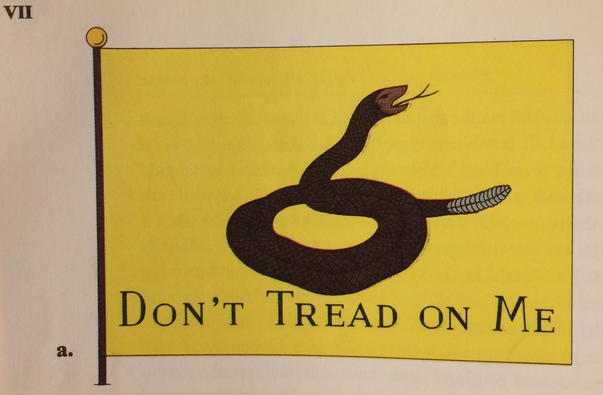
The earliest illustration we’ve come across is a decidedly unconventional one in Whitney Smith’s The Flag Book of the United States (1970). Louis Loynes and Lucien Philippe did the illustrations, so one or both of them produced this version found in Plate VII:
Online, we found this GIF created 5 April 1998 by Rick Wyatt still being used in the Flags of the World database.

In the world of social media, back on 8 September 2005 Wikipedia editor Vikrum uploaded a PNG version of this same design — “Historic Gadsden flag created by me based on existing renditions of it.” — a free, shareable version:
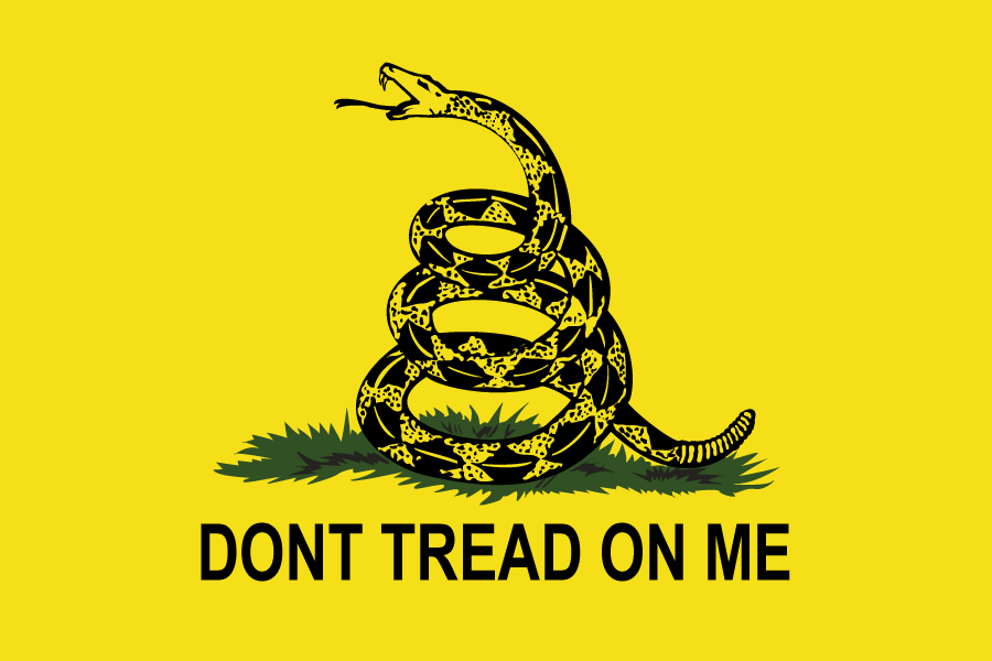
Four years later, on 21 February 2009, Wikipedia editor Ptkfgs (now known as BurnDownBabylon) uploaded the version now found there. They wrote “arial is wrong for the gadsden flag. it didn’t exist until two centuries later. i have re-set it in caslon: 1. it existed when the flag was created; 2. it was quite popular in the colonies; 3. the surviving period flags use a serif typeface.” Thus, we have the de-facto Internet standard:

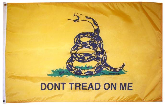
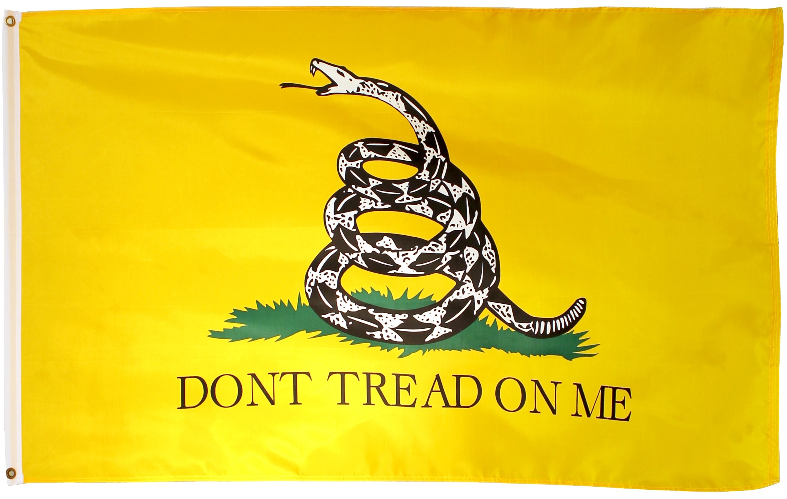
But it appears that recently manufactured “Gadsden” flags, on the other hand, typically use the sans-serif text we’ve seen in the Vikrum or Rick Wyatt versions. In fact, these manufactured designs are almost certainly the source of the versions seen online.
Here’s a sans-serif example from a 2010 posting (at the height of Tea Party frenzy) by Dave the Sage’s blog The Conservative Citizen, The flags and symbols of the TEA Party:
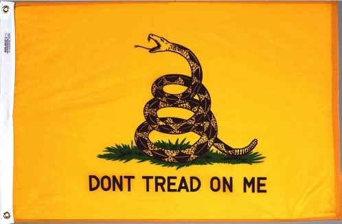
Annin, the largest US flag maker, has been selling this version since at least 2002:
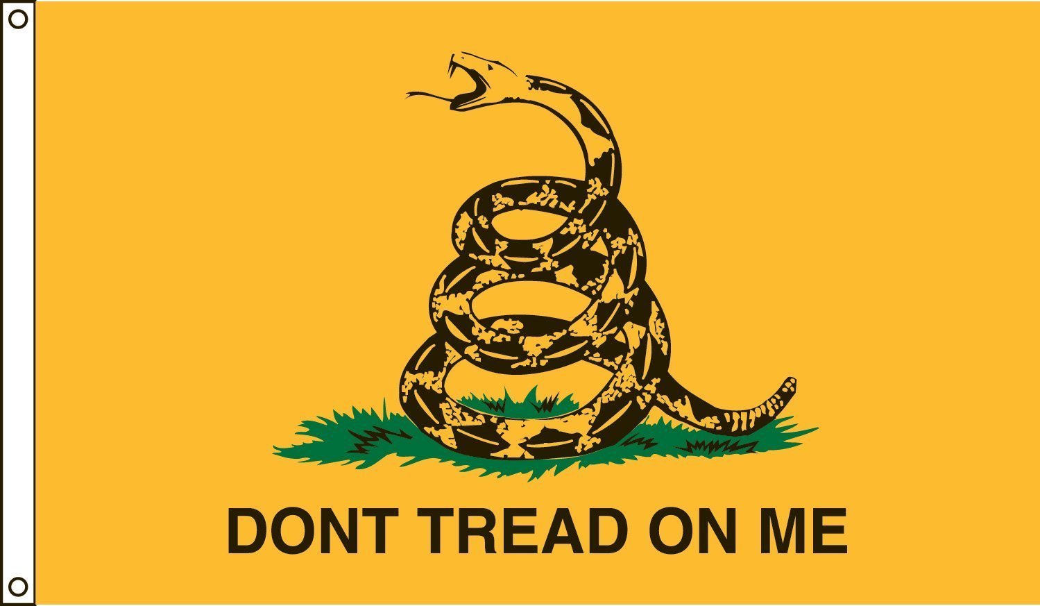
And as is the case with many other flags, the most common examples are likely manufactured in China, like this one:
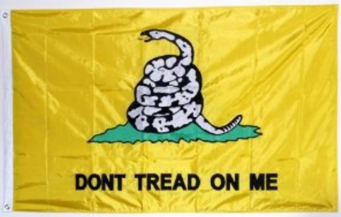
Or this embroidered, two-sided one:
Interestingly, given their proliferation online, manufactured versions with serif fonts are harder to come by. But Valley Forge sells the Whitney Smith version as the “historical Gadsden flag”:
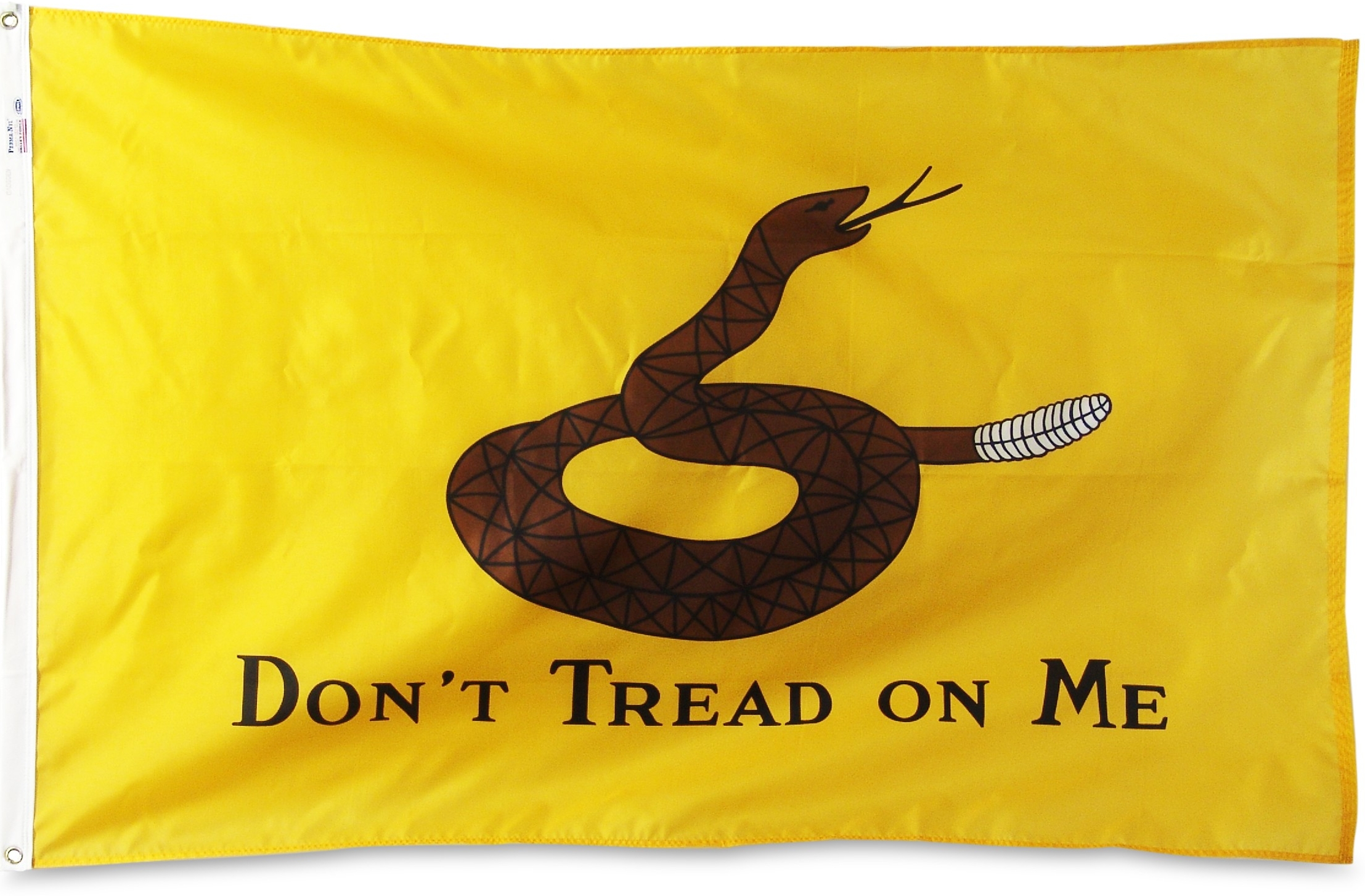
Valley Forge also makes a sans-serif “current Gadsden Flag” featuring a snake with a red tongue:
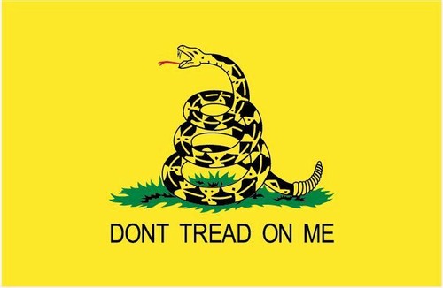
“Wikipedia-standard” Gadsden flags can also be found, made in China:
These designs (with the exception of the Whitney Smith variant) are all very similar. But the Gadsden Flag has been extended, satirized, and otherwise adapted in a huge variety of ways — the subject of another post.
