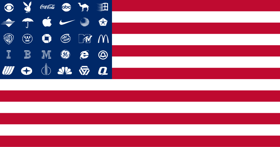
The 4th basic principle of flag design is “no lettering or seals”. Logos generally fall under this category as well. This doesn’t keep lots of flags, particularly of corporations, from having logos on them. And occasionally a logo flag works well as a flag — usually because it obeys all or most of the other four principles (keep it simple, use meaningful symbolism, use 2 or 3 basic colors, and be distinctive or be related).
The McDonald’s logo, the Golden Arches, is one that works well on a flag: it is simple, bold, distinctive, and the stylized M is readable from the front or back.
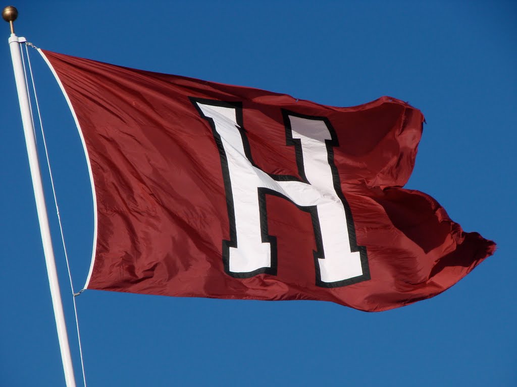
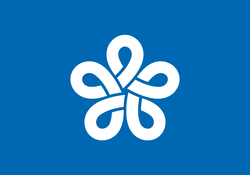
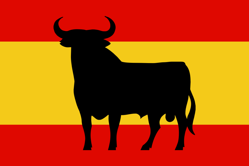
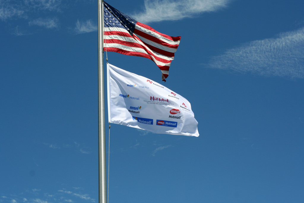
Harvard’s H also works well for the same reasons as McDonald’s (though it is far less distinctive). Letters A, H, I, M, O, T, U, V, and W all exhibit vertical-axis symmetry. (Photo by panoramio user karenjill.)All of Japan’s prefectures use what are essentially logos (mon) for their flags (and as a result risk being mistaken for corporate flags). This is Fukuoka’s, a stylized ふく (fuku) that also symbolizes a plum flower.Spanish flag with the Osborne bull. Originally the logo of the Veteran brand of Jerez brandy produced by the Osborne Group, large cutouts of the silhouette bull have been used as roadside advertising, eventually becoming popular and officially recognized.Here is a flag with many logos: all the different Microsoft Hotmail logos that were used from 1997-2006. Photo by Nial Kennedy, taken 14 July 2006, posted on Flickr.One of Adbusters’ American Corporate Flag designs. These use culture jamming to express dissent. Unlike the Hotmail flag, the multiple logos here work effectively as they, as a group, meaningfully replace the stars of the Stars and Stripes.