
The US flag changed as states were added, with additional white stars appearing in the blue union to symbolize the growth of the country. (Wikipedia has a nice table illustrating the historical progression of the 28 different designs.)


Meanwhile, to the north, our Canadian neighbors were changing their flag in an analogous way as their country grew by adding provinces. Unofficial US flags were sometimes manufactured before official designs were in place, but owing to differences in how flags were made official in the US and in Canada, only unofficial Canadian flags were the norm for most the the 51 years between 1870 until 1921. It was these unofficial flags that grew in complexity with each new province or provinces.
Analogous to the US flag’s union, showing the states as white stars in an blue field in the canton, was the Canadian Shield which until 1921 represented the provinces each with their own provincial seal in a section of the heraldic shield, which was placed as a “badge” towards the fly (right edge) of a British red ensign.
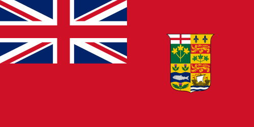

As you can see, each provincial seal was pretty complex, consisting of two or sometimes three different designs in different sections — certainly way more complex than a white star. By 1907 there were 19 different designs (and 21 designs total, if you count the three repetitions of the red cross of England) vying for space on the crowded shield. On November 21, 1921 a royal proclamation drastically simplified the shield by doing away with provincial representations, instead showing the Royal Arms of England, Ireland, Scotland, and France, above three maple leaves.

Of course, the flag would be completely redesigned and radically simplified in 1965, when the Canadian Maple Leaf flag as we know it was introduced, 50 years ago. It is with these simplifications that the analogies with US flags end: an analogous simplification, redesign, or improvement of the US flag is basically unthinkable.
A full account of the many twists and turns of the development of the Canadian shield in the 19th and 20th centuries is a long and interesting tale. Fortunately, Pete Loeser and Michael Halleran tell it nicely in their essay, Canadian Coat-of-Arms and Shields, on the Historical Flags website.

Thank you. I have learned something new about Canada’s old flag. I think the 1965 Maple Leaf flag was a necessary device to replace the old Ensign? -JPG