
Michael Green is a designer, self-proclaimed Flag Geek, and author of the excellent Branding the Nations blog on Medium.com. In his posting on (the sad state of) US state flags, The Good, the “Meh” and the Ugly, he asks a fundamental question that is too often taken for granted in discussions, debates, and contests about flag design: “What is the point of a state flag anyway?” His answer: state pride.
Flag design isn’t where state pride is born, but it’s where it can live and grow.
This claim is not uncontroversial. One can imagine other purposes for state flags: to mark official government buildings, or to allow the state to participate in flags-of-all-states displays. On Medium, it produced this exchange in the comments section:
Do we really need people rallying around their states, a kind of scaled down nationalism (which easily turns into unproductive competitiveness and even resentments)? [Comment by Norman Dale]
It’s a good question and it is worth exploring. I definitely see the resentment a lot living in Texas. But I personally think the good outweighs the bad. [Reply by Michael Green]
Competition brings progress, and trying to out-do other states can only add to our productivity as a nation. I love looking at this seldom approached topic. [Reply by Jon Sauder]
But instilling pride is certainly important, especially when it comes to adoption of a flag by a populace. In his essay, Green relates state pride into a “proper hierarchy of pride”:
- Nation
- State
- City/Team
This hierarchy can manifest itself in symbols at one level referencing symbols at a higher one, as when sports teams incorporate their state flags into their logos.

But poor state flag design inverts this hierarchy, and results in a kind of synechdoche — using a part to represent the whole:
But in states where they have no decent visual branding in the form of a flag, state sports teams (with their superior logos, traditions and colors) usually take over the visual branding of a state. Citizens then funnel what state pride they have into their respective team. This creates more “team pride” than “state pride” and can segment state pride when you have more than one dominant team.
This is an excellent point, certainly born out in Oregon, where the logos and flags of the Oregon State University Beavers and the University of Oregon Ducks are seen way more often than the meh-is-putting-it-kindly Oregon state flag. And in this rivalry of visual branding, the Ducks have an advantage, as they use not just professionally designed graphics but in fact one of the most famous global brands — they use Disney Corporation’s Donald Duck to be the Oregon Duck.
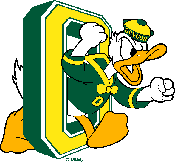
Passions around Ducks vs. Beavers run high and reach their boiling point in an annual “Civil War” game. As Green points out, these “segment” symbols do a poor job of representing pride in the state as a whole, however. Without a decent state flag, Oregon pride is most clearly shown in the domain of bumper stickers.
Green’s pride hierarchy also provides a way to think about the relationship between the “visual branding” of the Major League Soccer Portland Timbers and the city of Portland. When the Timbers were promoted from minor league to major league status in 2011, the Portland city flag was seldom seen — in the city, or at their games. It flew in the city at city hall and in the main public square, and at a few other sites. It flew at Timbers games from a stadium flagpole, and the fanatical Timbers Army waved some in the stands, but not as much as they waved Timbers logo flags, Cascadia flags, and even green-and-white Nigerian flags.
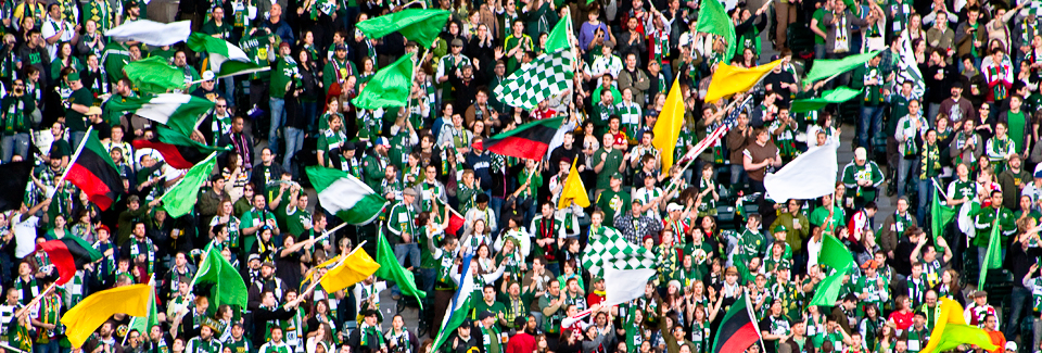
Over time, the Timbers Army grew to embrace the Portland flag more and more; it started to eclipse other flags at games (though the Cascadia flag is holding its own). This led to the city flag achieving a kind of official status with the Timbers, as in 2014 Major League Soccer entered into an agreement with the city to use a modified Portland city flag on merchandise.

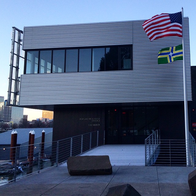
As its use at Timbers games increased, Portland residents became more used to seeing their flag (and learning that their city had a flag), and its use outside of Timbers games increased — and it became a more important part of the city’s official branding, as in 2014 Portland Fire and Rescue was instructed to fly it at all of their stations throughout the city.
In terms of Green’s hierachy then, the Timbers/Portland flag example shows how — in the context of there being no compelling visual branding at the state level — a team can make use of a well-designed but underused city flag, and begin a positive feedback loop between the “team” and “city” levels, strengthening the branding (and pride) of both.
