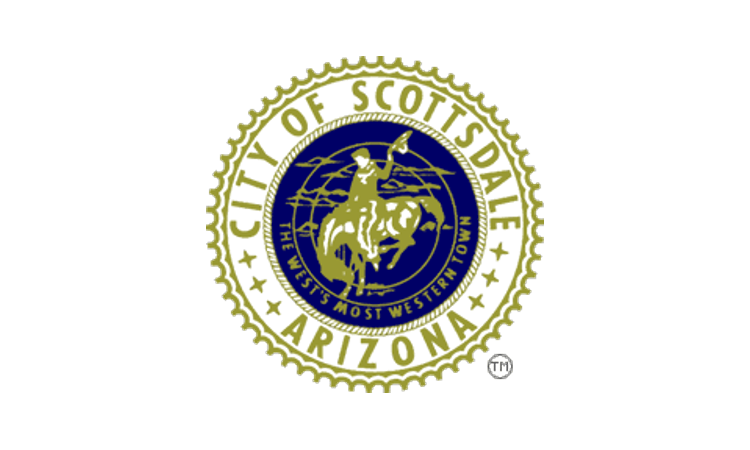
The municipal government of Scottsdale, Arizona — “the West’s most Western town” according to its uninspired current flag — is narrowing in on a redesign and inviting public input. Why? “Scottsdale hopes a new flag will become an immediately recognizable symbol of the proud and accomplished desert community known around the world for its blend of western heritage, natural beauty and modern art and culture.”
Here are the contending proposals. (Interestingly, the web survey shows each proposals at two sizes, to allow the design to be read both close-up and at a more typical viewing distance.)
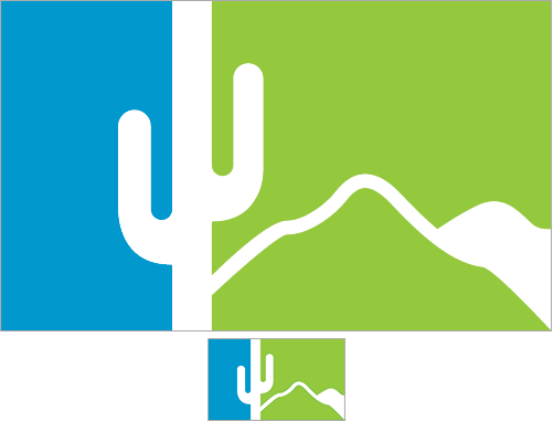
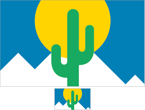
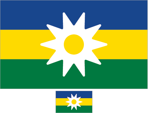
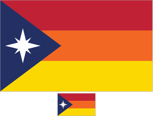
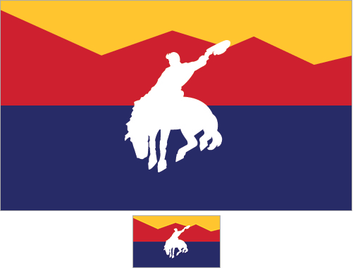
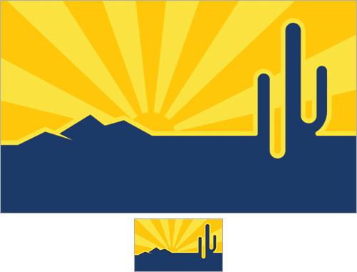
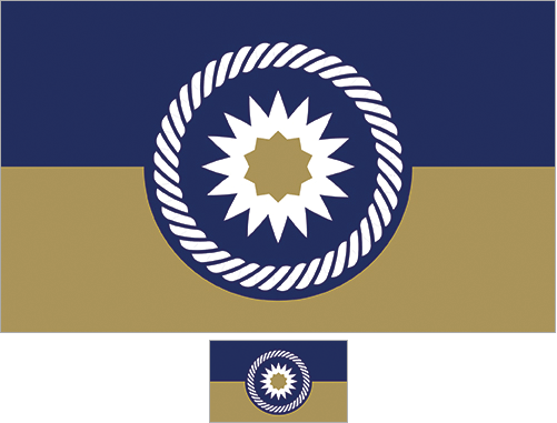
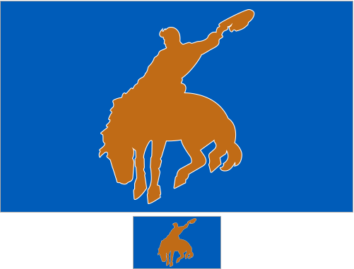
This design represents the natural beauty and desirableness of Scottsdale’s geography and desert climate. The flag depicts the sun rising over the mountains of the McDowell Sonoran Preserve. Old Town is represented with the iconic cowboy logo which is also utilized in the City’s logo, seal and current flag. The blue and gray are traditional colors that are prominent in the City’s logo. The “sun-ray” design is borrowed from the Arizona state flag to provide a logical connection between state and city.Our stark blue sky creates a bold backdrop for our 48-square mile Preserve, making up more than 25% of the city limits. The outline of the mountain is meant to represent a portion of our 181 miles of trails. It’s only fitting to have a majestic sagurao on “West’s Most Western Town” city flag. Incorporated just in 1951, so many of the saguaro’s we see today were here well before then, thus becoming one of our city’s most loved icons.Having fallen in love with Scottsdale and moved here 3 years ago, these elements are why my husband and I are now permanent residents: the glorious sun, the stark blue sky, the undulating mountains and the magnificent flora. With an average of 314 days of sunshine, who wouldn’t want to live here?! Sunshine makes people happy and should be a key element on our flag. In 1994, the first parcel of land was dedicated as the McDowell Sonoran Preserve. This vast treasure, taking up just over 25% of Scottsdale, is a draw for locals and visitors alike as the largest urban park in the U.S. From the spring wildflowers to the ever towering saguaros, the stunning beauty of our flora is unmatched. These 4 elements together make up Scottsdale’s new flag.Scottsdale, “The West’s Most Western Town”, is synonymous with relaxation, open spaces, natural beauty, blue skies, sunshine, luxury, amazing events, and warm, welcoming people. This flag design reflects this. The American-flag/Arizona-flag blue at the top represents the 300+ days of clear blue skies stretching from horizon to horizon. There is a luxurious gold strip horizontally across the middle. The luscious green at the bottom represents our verdant spring desert, the preserve and the mountains that surround our dale. The white symbol at the center is a simplified version of the city seal, and is both a cowboy’s spur and a sun. It has ten points to spell out the name SCOTTSDALE.The blue triangle represents the McDowell Mountains as seen from a distance. The compass rose represents the travel industry, which makes up a large part of Scottsdale’s economy. Its white color symbolizes the cleanliness of the city. The three stripes are arranged to represent a sunset. The red stripe represents the beauty of Scottsdale and the surrounding desert. The orange stripe pays homage to Scottsdale’s original name, Orangedale, and to the citrus trees planted upon its founding. The yellow stripe represents the abundant sunshine. The yellow and blue were borrowed from the coat of arms of the city’s founder, Winfield Scott. All colors but orange and white are the same shades used on the Arizona state flag.The Scottsdale flag consists of 4 red mountain peaks representing the McDowell Mountains with the Saddleback Mountain in the middle and the highest peak in the east (far left side of flag). The McDowell Mountain preserve is central to Scottsdale wildlife and resident activities. The weld-yellow sky is symbolic of Arizona’s beautiful sunsets. The blue at the bottom of the flag represents the Salt-River which runs through the southern border of Scottsdale. In the center is Scottsdale’s official city seal, a rider astride a bucking horse, which symbolizes the deep roots in the old west and western activities. The Scottsdale flag resembles the Arizona flag in color scheme which allows it to be more easily recognized by Arizona residents or people visiting from out of state.The icons of the cactus and the mountain range were chosen to represent the beautiful horizons and mountain ranges surrounding Scottsdale. Highlighted are the breathtaking, radiant sunsets, represented by the blaze of orange and yellow. The deep royal blue was chosen to create a visceral connection to the depth of elegance within Scottsdale.The middle of the flag features a sunburst in the middle of a pure white Giant Saguaro blossom, our state flower and a favorite of Scottsdale. Around the white flower blossom is a circle of bold deep blue and white rope representing our wild west heritage and lifestyle. The background is split horizontally with a golden tan on the bottom representing our arid desert landscape and a deep blue representing our year round beautiful skies. The blue is similar to our state, county, and country flags.This City of Scottsdale flag design is based on a petroglyph originally found on the west side of the McDowell Mountains near DC Ranch. In 1937, Frank Lloyd Wright relocated the boulder to Taliesin West, inspiring its symbol. It reflects the artistry of Scottsdale residents, ancient and modern. The clasping hands symbolize the collaborative spirit that has taken place in Scottsdale through the years resulting in such community amenities as the Indian Bend Wash and the Scottsdale McDowell Sonoran Preserve. The blue background is the same as in the Arizona and United States flags and reflects the municipal connection to the state and federal governments. The brown represents the color of the Sonoran Desert and the McDowell Mountains. The blue lines also symbolize the canals and washes, and the brown lines symbolize the mountains that surround the community. The negative space between the clasping hands creates an “S” for Scottsdale.This flag design option portrays a version of the most prominent symbol of Scottsdale, in a simple but powerful form of the Cowboy and Horse. The blue represents the blue skies typical of Scottsdale and city color of blue. The copper represents the southwest, copper state, and the iconic sunsets.
As with many of these redesign efforts, it is worth asking whether deciding between these specific options through a public poll will lead to a better result (a more widely adopted flag) than would hiring a design professional to produce a final design after taking these amateur ideas into thoughtful consideration.
(Also, Oregonians will beg to differ: Port Orford, Oregon and obviously not Scottsdale is the literally most western incorporated settlement in the continental US.)
1 thought on “Scottsdale, Arizona Redesign Poll Closes Feb 28”
Good question Scott. But almost when ever a design professional gets involved in such a process there are calls from the local communities not to “waste” tax money, but to spend it on roads and education. What are council to do? They often want the benefits a new design can build a better image but the results are often patchy. Nixa, MO, payed for the logo then passed on getting on with having a better seal and let the winner shortcut the real effort and just run the logo in. Thinking back to that one which had that xxxx design. How much did that cost? Think it was done without any public consultation. Then widely condemned. It’s almost as if the public contests should be the baseline, then offer up the entries to designers (both a few local graphic designers and a few expert vexillolographers) to further finesse if they can tender and produce better within a very bare bones budget.


Good question Scott. But almost when ever a design professional gets involved in such a process there are calls from the local communities not to “waste” tax money, but to spend it on roads and education. What are council to do? They often want the benefits a new design can build a better image but the results are often patchy. Nixa, MO, payed for the logo then passed on getting on with having a better seal and let the winner shortcut the real effort and just run the logo in. Thinking back to that one which had that xxxx design. How much did that cost? Think it was done without any public consultation. Then widely condemned. It’s almost as if the public contests should be the baseline, then offer up the entries to designers (both a few local graphic designers and a few expert vexillolographers) to further finesse if they can tender and produce better within a very bare bones budget.