Finalist 1: “The flag represents the breathtaking Everglades’ sunset that the city is lucky enough to have in its own backyard.”Finalist 2 (winner): ‘Florida, “Where the Sawgrass Meets the Sky”. Just like the title to the State of Florida’s official anthem, Coral Springs is a city that Reflects what is still true to this State. Right on the edge of one of Florida’s Natural Gems, The Florida Everglades, this flag reminds us of each level the city has grown into and gazes into the future of greater things to come.’Finalist 3: “From sunrise to sunset….the City of Coral Springs has everything under the sun! The bands of color were inspired by a recent sunset experienced in our city. The bands can also represent, along with the rays of the sun in the logo, the many amenities we have or the diversity of our city.”Finalist 4: “The sun is actually a “C”. The palm tree is an “S” – Coral Springs. The sun and tree represent the perfect day. The Blue background represents the endless possibilities found in our city and the ever-growing city itself. The white circle represents unity.”Finalist 5: “The sun in the corner radiates through a light blue sky over our City of Everything, surrounded by a deeper blue band representing beautiful pools, waterways, fountains, and Aquatic Complex, bordered by a curve of green to represent our renown landscaping, parks, and trees. The design proclaims Coral Springs is a beautiful place!”Finalist 6: ” When designing the flag: The sun represents the core of Coral Springs. The blue rays represent the extension of family, while keeping the brand of the logo in the flag.”
Like many such contests, Coral Springs’ referenced Roman Mars’ TED Talk and the Good Flag, Bad Flag guidelines. (Though somehow rule 3 turned into “Use basic colors: Flags wear over time, and using basic colors ensures a long lifespan. Limit yourself to 3 colors from a standard 10-pack of markers.” It’s unclear that “basic colors” wear any less quickly than others, as wear is a complicated dye-dependent photochemical reaction.)
Unfortunately, contradicting the above, it also promoted the use of the “palette of colors … approved for the cities [sic] branding”:
Furthermore, the judges apparently disregarded the importance of simplicity in flag design by passing over a number of simpler submissions in favor for the more complex designs in the six finalists.
Here are some of the other simpler submissions deserving, in my opinion, of at least an “honorable mention”.
Nicole Utrera: “The shapes are supposed to represent the ground, sky, and sun with the rising ground symbolizing how Coral Springs is growing as a city.”
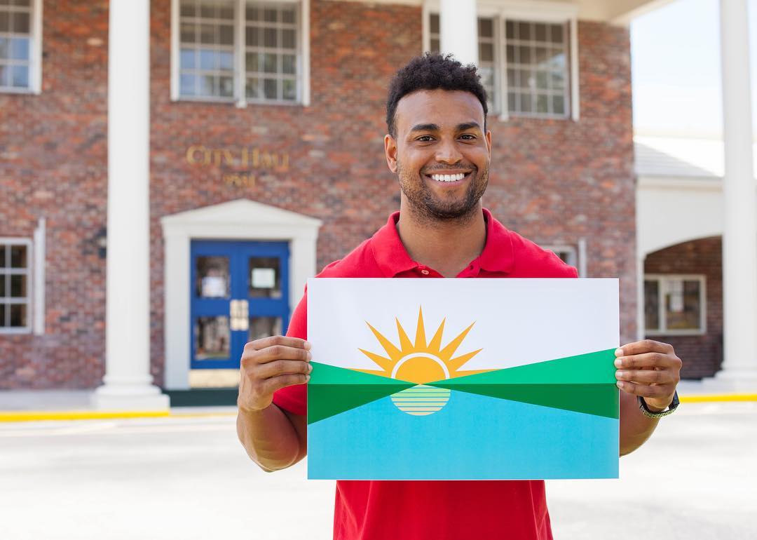
Kenneth Ariza: “Inspired by the city slogan, “Everything under the Sun”. And by the Everglades that is close to home. The design is simple and modernistic. The half yellow circle symbolizes the sun setting behind the green stripe that symbolizes the Everglades. The bottom blue stripe symbolizes our surrounding oceans. The hues were chosen from top to bottom in order for the exterior colors to blend in nicely in the center. It gives the flag a gentle flow from a warm colored sun to a cool blue tone. From a distance it is easy to depict that the flag portrays a city that cares about its environment.”
Alejandro Sanchez: “My flag shows three stripes and five rays. The green line represents the green grasses of Coral Springs. The light blue represents the blue sky’s, Coral Springs always has. The yellow rays are the rays from the sun that constantly shine above us. The dark blue represents the night and its covered by a sun ray because even though there is no sunlight during the night; the nights in Coral Springs are always warm.”
Andres Franky: “The flag represents the breathtaking Everglades’ sunset that the city is lucky enough to have in its own backyard.”
Nathaniel Aymer: “This flag symbolizes the motto “Everything under the sun” elegantly with the same refreshing color palette used with the City Of Coral Springs. It is very simple but very distinguishing.”