
Jeppe and Birger Morgenstjerne of the Danish design agency Ferdio recently released an extensive set of beautiful vexillological infographics entitled Flag Stories. These have attracted, deservedly, considerable attention around the web, including that of Linda Poon of The Atlantic‘s Citylab. In her article What’s in a Flag’s Design? she asked our very own Ted Kaye to help put five of the Morgenstjernes’ analyses of the national flags of UN member states in context:
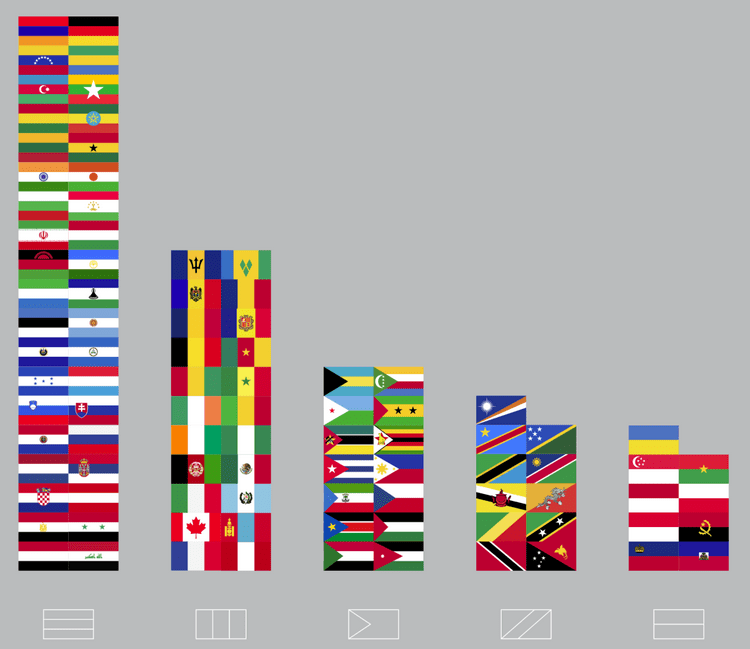
- The three-striped “tribar” layout is the most popular
- Red, blue, and white dominate the colors of the world’s flags
- Colors have individual meanings, too
- The star is the most commonly used symbol on flags
- The simpler the flag, the more efficient it is
Check out Linda Poon’s interview with Ted Kaye here:

What is that horizontal blue/white/green flag with a yellow symbol in the middle (by the way forbidden to have pale on pale ;). ) ? it’s a not a country…
Good eye! You are right insofar as it’s not one of the member nations of the United Nations – it’s a federal subject of the Russian Federation: the Republic of Bashkortostan. It does seem out of place in that infographic. As for “forbidden” color juxtapositions, not every flag follows the conventions of European heraldry.
Thanks!!! Bashkortostan!!! wow… did you really know that one or you had to do some research? ;) Maybe one day it will become independent after a long war… :p
As for the European heraldry, I see your point but still I believe there are rules given by the God of Vexillology that apply to all flags simply due to reasonnable logic… yellow on white is invisible.
I found it by googling “green white blue flag” – amazing how often brute force works :-)
I did that too… but couldn’t find anything :( Your google is better than mine.
I guess the author wanted to put Tadjikistan flag, which is somewhat similar, but somehow got confused… ;) My theory.