
As every Oregonian Portlander knows, our city name was the result of 1845 coin tosses between two founders from New England, a Bostonian and a Portlander. So it is with special interest that we see that our namesake city has now joined the long list of US cities in which vexillonaires are trying to improve the existing flag.
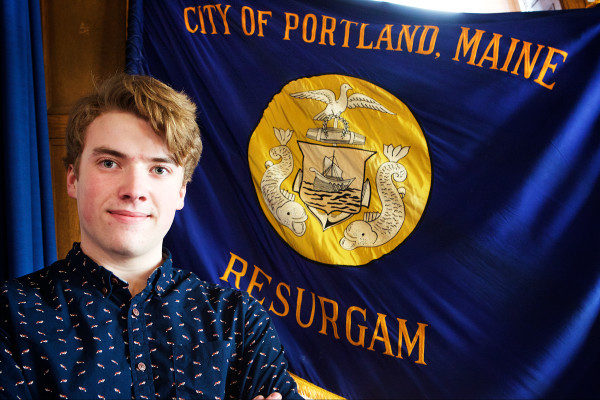
The vexillonaire in this case is Benjamin Coursey, a senior at Casco Bay High School. (That’s him in the photo above, by Troy R. Bennett, Bangor Daily News.) As BDN reported Monday:
Coursey’s senior project at the Portland high school is to convince city officials to replace the blue-and-gold flag with something better. He plans to lobby city councilors — he said he’s already started — and ultimately hopes to propose an alternative to be adopted.
Along with nationally respected flag experts Ted Kaye [of the PFA] and David Martucci [of vexman.net], he will help judge reader entries into a BDN Maine contest for new Portland flag designs.
The winning flag design will earn a prize of $300 and will be on the short list of designs that Coursey plans to lobby the council to adopt.
Here is Coursey describing his project in one minute:
https://bangordailynews.com/embedvideo/?video_id=2141535
Note: The deadline to enter the flag design contest is Monday, March 28th, 5pm Eastern Time.
The existing flag of Portland, Maine is obscure enough that there does not appear to be a high-resolution graphic of its design available online. The best we have is a GIF Dave Martucci created in 1998:

Portlandmaine.gov provides a better view of the city seal:

Apparently there is no city ordinance defining the flag, so it’s not surprising that there are several different variants. There is the version Coursey is standing in front of in the photo at the top of this page that Martucci used for his graphic above. Adding to possibilities for confusing Maine with Oregon, from a distance in a breeze this Portland flag could easily be confused with the front of the state flag of Oregon:

There is also this version City Councilor Ed Suslovik can be seen presenting in 2007 to Portland’s sister city of Archangel, Russia:

From a distance, with the blue faded from the sun, it might be mistaken for the flag of Palau:

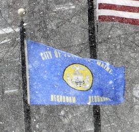
And there is this variation on the first version, photographed in a snowstorm by Dave Martucci in 2011:
For more context about city flags in Maine, check out Seth Koenig’s BDN feature from the end of last year: Portland’s city flag included in a rogue’s gallery of bad flags. Is it time for a redesign? Looking through the FOTW page on Maine municipal flags he writes:
…it seems the flags of Augusta, Auburn, Bangor, Biddeford, Eastport, Kittery, Lincoln, Lisbon, Thomaston and Wiscasset — as well as the aforementioned state flag — are all Seals On Bedsheets, with a number of other towns boasting flags that aren’t much better.
But he gives a shout-out to two very nicely designed Maine town flags: Jeremy Hammond’s flag for Bath, and Dave Martucci’s flag for Washington.


Koenig concludes:
Could Portland learn from these smaller Maine municipalities, apply a similar logic as it used in drafting a new slogan and give its city flag an overhaul?
Vexillologists seem to be saying yes. Portlanders are probably saying, “Wait, we have a city flag?”
For more on the Portland, Maine flag:
- Our previous post on flags featuring Phoenixes
- FOTW’s entry for Portland, Maine
- James Croft’s chapter Portland, Maine in NAVA’s American City Flags
Addendum
On 14 March noted vexillologist, former NAVA president, and contest judge David Martucci published The story behind Portland’s terrible flag, and one idea for a better design. He suggests drawing from the existing flag something like this:


Though the design contest sputtered out, a new effort has taken root: https://flagforportland.me/