
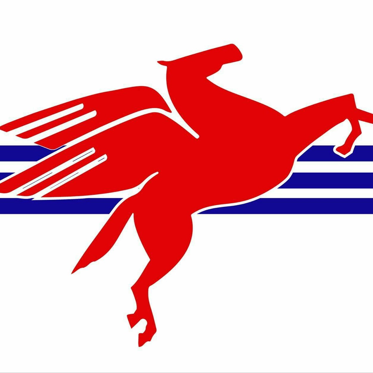
In an interesting twist on the “let’s improve our city’s flag!” meme that, courtesy of Roman Mars, is circulating around the U.S., a Facebook-centric initiative is underway in the Big D, Dallas, Texas. And a rapidly-moving initiative it is! Dallas I. May created the Facebook page Your Dallas Flag less than a month ago. After some discussion of design alternatives there, the group decided upon a design based on May’s original idea. Two weeks ago, May began gathering signatures on a petition to Mayor Mike Rawlings and Dallas’ 14 city council members that “the Pegasus and the Trinity” be made the official flag. As of today, it has 158 supporters.
The effort has been helped by local media coverage, and, apparently, by Dallas May’s connections. Here is what Rudolf Bush wrote October 1st in the Opinion Blog of The Dallas Morning News (emphasis added):
Probably like many of you, I don’t come across it that often and, when I do, it’s just a piece of visual clutter in the background that I edit out of my mental scene. It’s basically invisible even when it’s right in front of me.
That shouldn’t be the case. And Dallas May, an engineer who a lot of us know because he’s very much involved in the conversation about our city, has set out to do something about it.
He’s convinced me.
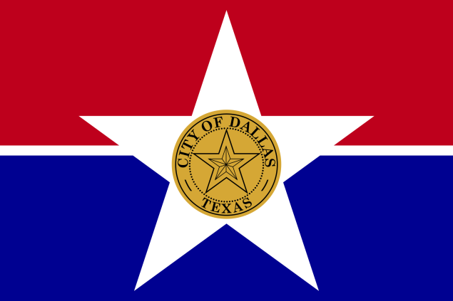
The reason I ignore the city’s current flag is probably the same reason it isn’t widely flown around town – the design stinks.
The background is probably salvageable, as is the central star. But whatever symbolism those offer is lost on me.
The weird part is the city seal jammed in the middle. It’s basically a gold coin, a little city of Dallas doubloon. And, naturally, its labeled “CITY OF DALLAS” in case you missed the point.
It also gives us a star within a star within a star. The effect is not…effective.
Published criticism appears to be mostly tongue in cheek. For example, this week Zac Crain has been offering his own proposals on the Front/Burner blog of D Magazine:
Journalist Robert Wilonsky of The Dallas Morning News published a really very thorough “history of Dallas’ official flag, which everyone either forgets about or wants to change“. It contains a great example of the fate of city flags that are intended only for government use as one of its symbols, not for public use as a symbol of the people. By the 1960s only three examples city’s first flag, a 1916 design by Jane Malone, were known to exist, as described in this short piece Wilonsky includes:
One faded Dallas flag hangs in the anteroom of the City Council Chamber. The Dallas Zoo has two others which it flies with the American and Texas flags.
“One is tattered and this is flown on bad days. The good one is saved for days when there’ll be a lot of people at the zoo,” a Park Department employe [sic] said.
A 1966 article entitled Dallas May Fly Official Banner (50 Years Late) concludes: “And finally, 50 years after Miss Malone designed it, prospects seem bright that the city will have an official flag to fly at ceremonial occasions.” And so it did, but according to discussion in the comments on Wilonsky’s article, the current flag can only be seen at City Hall, Police Headquarters, the Hunt Building, a freeway overpass, and possibley at the Dallas Country Club.
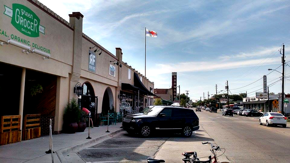
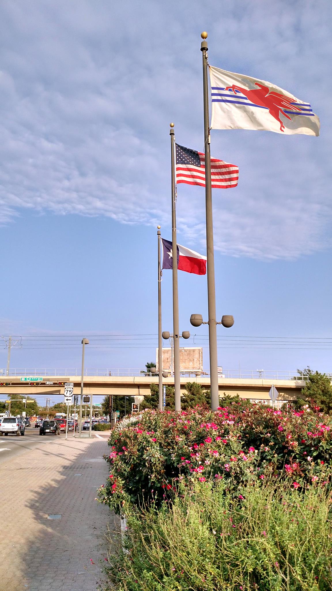
The populist Pegasus and Trinity flag is intended to be far more widely seen, and has been posing for photos in Facebook.

Finally, yes, a red pegasus is a famous logo used by ExxonMobil, in response to which Dallas May says this (click to enlarge):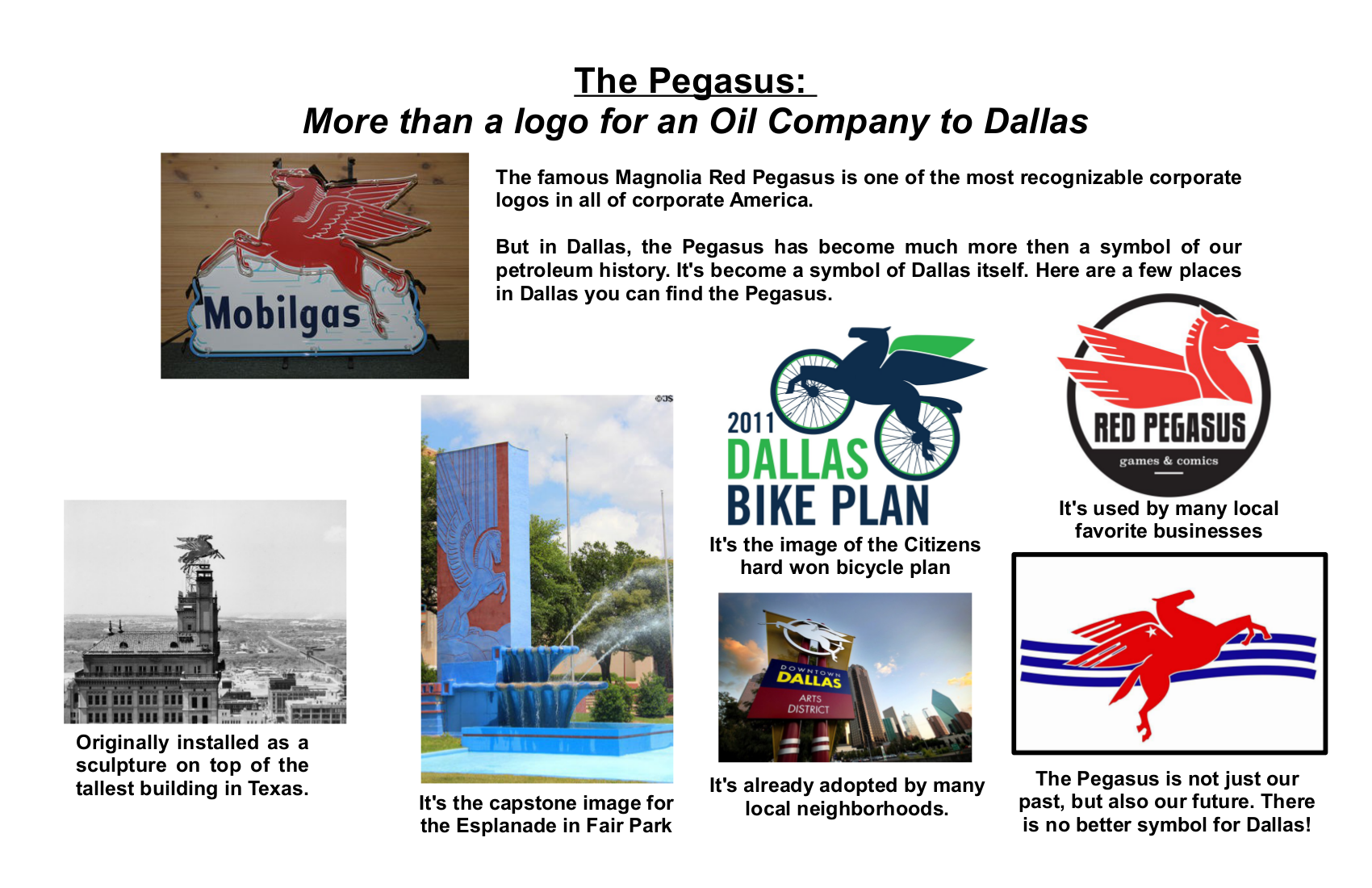

I lived in Dallas in 2007-8 and did see this flag but not very often. Not a constant presence and it is typically a Texas-inspired flag. The star is Texas most popular symbol. The problem with the flag is a seal of the City of Dallas that contains a star and is superimposed on the white star. It is a star within a star.. Dallas had a great flag but messed it up with a seal.
Correction. It’s a star within a star within a star.
The Pegasus and Trinity flag is an excellent design and while not typically “Texan”, it could incorporate a Texas star somewhere in the field, perhaps in the cantonal area?
If you haven’t lived in Dallas, you probably don’t get the Pegasus. Which is OK. The flag is for the citizens of Dallas.
First, just get rid of the gold seal in the center and you have a really nice flag. Insofar as the proposed pegasus, it’s a direct ripoff of the Mobil pegasus. Use a pegasus if you must, but at least do a unique drawing. Auto-trace in Illustrator is an insult to graphic artists who put a lot of craftsmanship into their work. It would be a shame if Dallas adopted a flag based on a company logo.