
Each month, collaborative design blog The Letter Society sets for its members a design challenge. Last June, Project 25 was City Flag.
For inspiration, they pointed to Roman Mars’ TED Talk The Worst-Designed Thing You’ve Never Noticed, featuring the PFA’s Ted Kaye discussing Good Flag, Bad Flag.
Here are the results of the design challenge:

Seattle, Washington. 1990 design by Paul Kraabel. Redesign by Alex Garey. “Although simple, the two blue-colored fields represent the dueling bodies of water, while the thin white stripe represents the city of Seattle itself, bisecting the two bodies of water.”
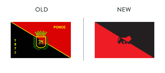
Ponce, Puerto Rico. Original designer unknown. Redesign by Poncean Frances Palmer. “For whatever reason, Ponce’s symbol or mascot is a lion. We have a basketball team known as the Ponce Leones and there’s probably like 1238 families with that last name.”

Philadelphia, Pennsylvania. 1874 coat of arms by Henry Christopher McCook. Redesign by Mark Manalysay features a ring of 13 stars found on the “Betsy Ross” flag.

Nashville, Tennessee. 1963 flag designed by unnamed “professional artists”. Redesign by Jake Nolan. “The detail in the star and compass will disappear at a distance but I wanted to give them more than flat treatment in case the element was extracted for other purposes.”

Atlanta, Georgia. Designer and date of original flag unknown. Redesign by Nathan Boyd. “The blue stripes at the top and bottom represent train tracks and Atlanta’s origin as a railway town, unlike many other southern cities at that time.”

Austin, Texas. 1915 design by Ray F. Coyle of San Francisco, CA. Redesign by Ryan Brownhill, who chose colors “that would stand out when flying along the Texas and American Flags.”

Cincinnati, Ohio. 1895 design by Emil Rothengater, aka “Zero of Burnet Woods”. Redesign by Jenn DiMenna, an “update” of the existing design, for example, replacing the original C with “the C now being used as the Cities logo, something more modern and simple that reflects the growth of the city in recent years.”
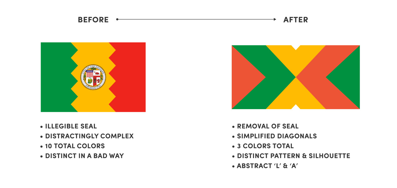
Los Angeles, California. 1931 design by Roy E. Silent and E. S. Jones. Redesign by Erik Wagner, “an evolution rather than a re-invention” with thought to “how elements of the flag could be used and apply to civic-centric design centered around neighborhoods, awareness campaigns, and even festivals.”
Project 25 also includes an interview with one of the designers involved, Alex Garey, who says: “Regarding the Chicago flag, I would like to go on record as saying: No flag is, or ever will be, as cool as the Chicago flag.”

Seattle: Current flag is a simple fix. Remove lettering and exaggerated wave pattern in canton area. The AFTER flag is boring. Lacks the most basic and crucial symbol of Seattle, the profile.
Ponce: NEW design needs to develop the centered symbol(s)…
Philly: NEW design is very good though in spite of the reversed colours it may remind others of the European Union. Take the OLD flag and try to develop a simple yet powerful symbol to replace the seal?
Nashville: AFTER flag is kind of the opposite of the OLD. It needs tweaking?
Atlanta: AFTER flag is superb. The Phoenix may not be the easiest to illustrate, but it is an example of looking at the old flag and re-designing from it.
Austin: AFTER flag is a good flag. It is the kind of design that can tweaked with several versions.
Cincinnati: NEW flag is more heraldic than OLD. The design works, but one can tweak it more?
I really hope that the Flag of LA is changed. However, I hope that it is done through an open contest. I have my self two variants of a new design and I would love to submit them for such contest. Either way, great cities deserve great emblems. Chicago and DC have great example of that.