
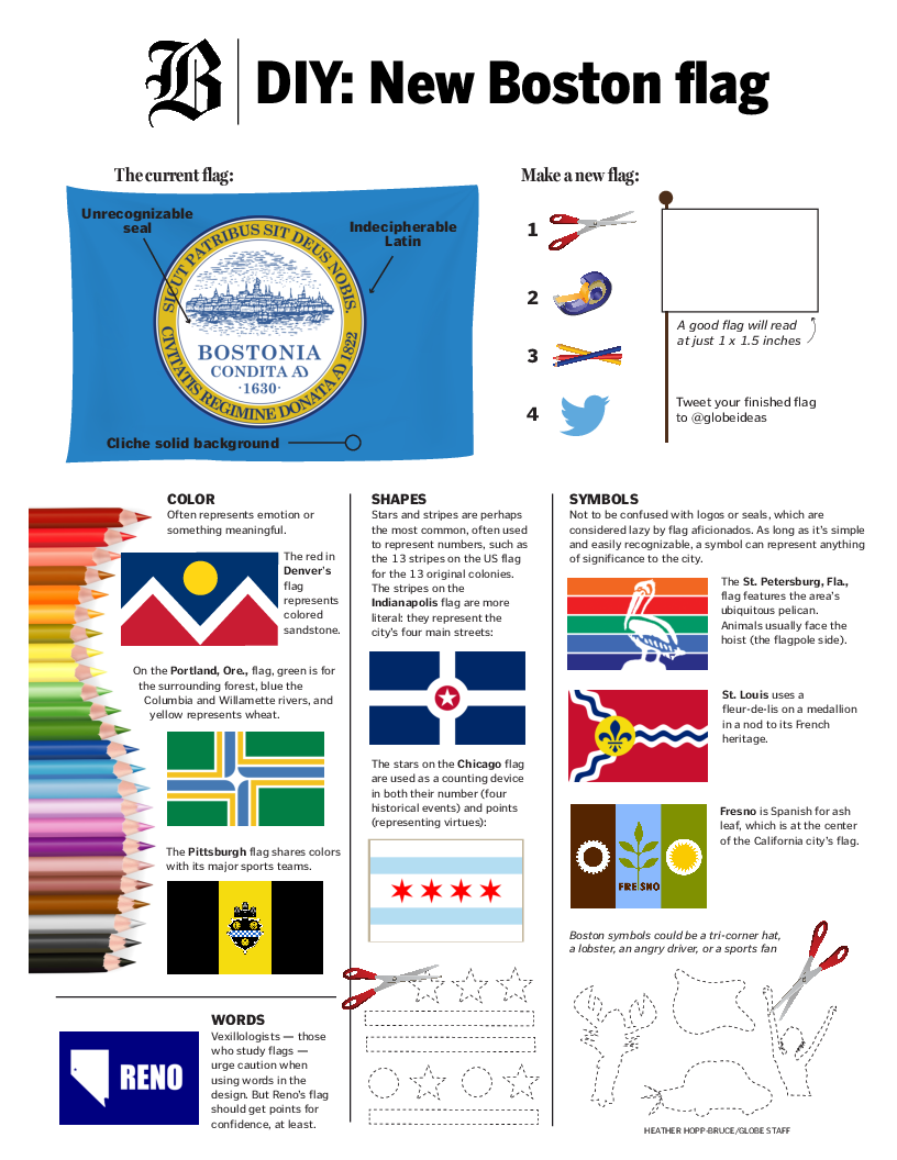
The Boston Globe took Flag Day as an opportunity to shine a light today on Boston’s city flag and its deficiencies. Ruth Graham’s op-ed “Improving Boston’s city flag” includes quotes from vexillologists Dave Martucci (of the New England Vexillological Association), the PFA’s Ted Kaye, and current NAVA President John Hartvigsen.

Martucci points to the current flag’s mediocrity and inoffensiveness: “It’s a longstanding American tradition to take whatever your seal is and slap it on a solid-colored background . . . no one’s going to argue you with you”. Kaye “doesn’t mince words”:
The Boston flag’s seal is too complicated, its Latin phrases indecipherable from a distance, and its seal-on-blue-background style totally cliche. Its color scheme is acceptable, he conceded, and the seal’s symbolism is meaningful, but it’s the kind of symbolism that belongs on a flat sheet of paper, not a flag.
Hartvigsen declines to offer an opinion, professional or otherwise, on the design quality of Boston’s flag, suggesting “Flag design is very much in the eye of the beholder”. He also objects to calling the flags of Nazi Germany or of the USSR “good” in any sense, despite them being examples of good flags, in the sense of well-designed flags, according to the principles published in Good Flag, Bad Flag.
The article is accompanied online by a quite well-designed “template” for sketching an improved flag for Boston, and a small gallery of flag images illustrating good and bad flags (at least as Martucci and Kaye understand them).
For some heated discussion on the Boston flag, check out this reddit r/Boston discussion. Also on Reddit you can find this proposed redesign from dj_roshambo.


That red flag looks like the flag of one of those former communist republics of the old USSR. I have a better idea, mind your business and leave our flag alone!