
Jonathan Parsons is a British artist who works in the medium of flags (as well as sculpture, painting, and others). One of his most colorful creations was a new flag for London (2003):
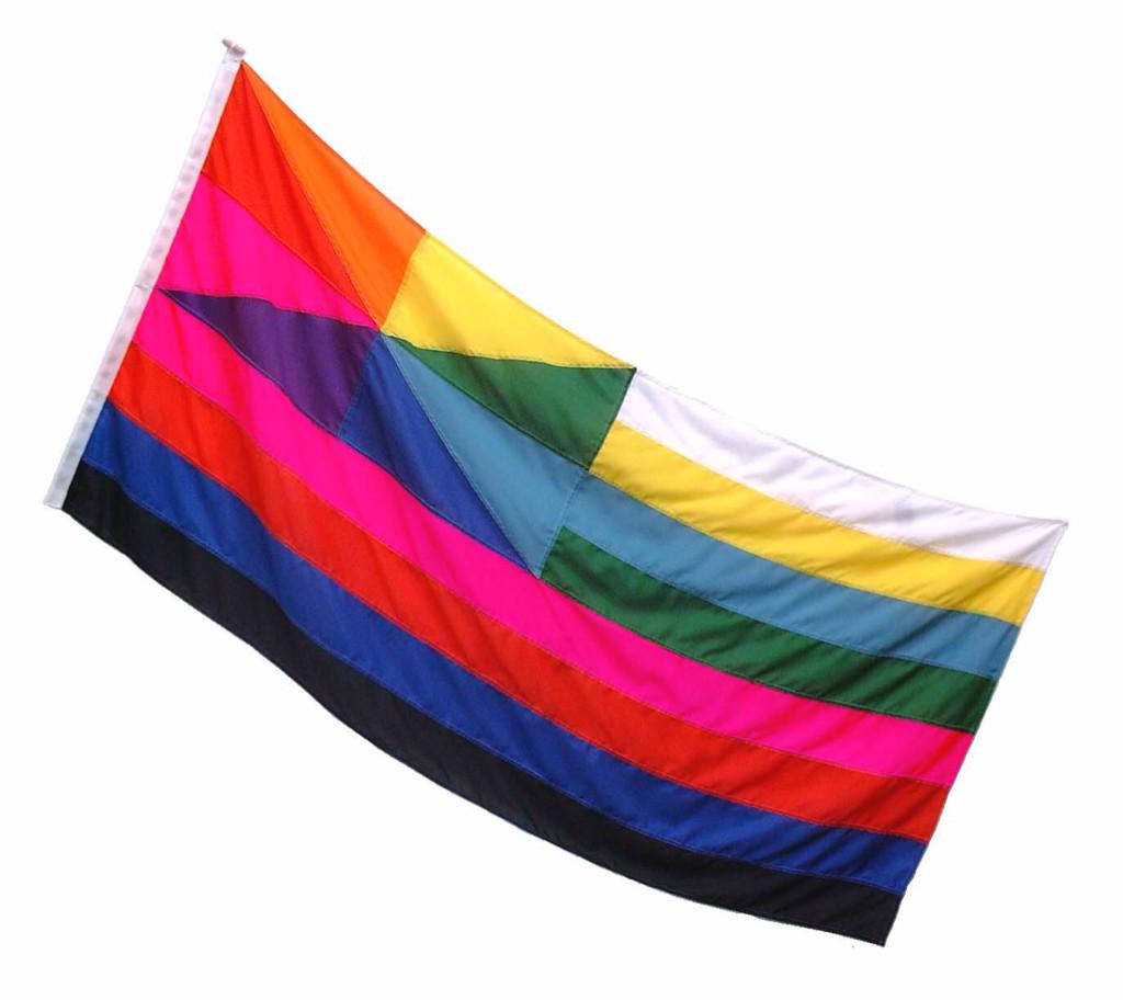
I decided that a flag for the new city state should be very colourful to reflect the city’s huge diversity. ‘Flag for London’, in a couple of important ways, is a traditional flag design. In the spirit of the new independent state, it subverts the old state flag (the Union Flag) and echoes the flag of a country that, through revolution, has previously gained independence of that state (the USA). In the layout of its colours, however, it is an entirely new national flag. The canton is ‘gyronny’ — ie it is divided in half in both directions diagonally as well as vertically and horizontally — and is coloured with the cycle of eight spectral hues. The field is divided into eight horizontal stribes that are a gradating tonal arrangement of the two sets of primary colours plus black and white. The way it is divided up, when hung vertically, can be seen to spell out the word ‘LONDON’. The striped field represents a capital letter L, while the gyronny canton contains squared versions of O, N and D. It literally has ‘London’ in it. Or, as a friend of mine said, ‘It’s London innit?’. (Parsons quoted in Time Out London.)
Parsons is currently leading the UK Parliament’s 2015 Flag Project, online at flags.parliament.uk, for which he’s produced some excellent materials on good flag design. For more of his many flag-related pieces, see the flag works section of his website, jonathanparsons.com.
